It's time for another project post. Alex and I totally nailed this one (unlike this project).
I have been in love with these types of signs forever:

There are so many great elements to get behind - The black and white contrast, the letters (I love letters and all kinds of fonts), the patina of a well-worn, cherished antique and the simpleness of such a statement.
I just love it, love it, love it.
As charming as I think they are, lots of other people think the same thing. So, they can be pricey and hard to come by. But Alex and I finally decided to do something about getting one of these in our homes.
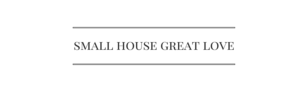
Of course, now we had to decide what they heck to put on the sign. This can put a lot of pressure on a girl.
Then I found this photo:

And I knew what I wanted my sign to say.
Did you know this is called a ghost sign? Old hand-painted advertising signs (painted by "wall dogs") on buildings are just so cool - What a great preservation of a different time. This building is in Topeka Kansas, but you can find them all over the country.
I just love the name of this store - SAGE GROCERY CO No 2. It's cool to think there was a No 1. I bet they were both super charming. I bet the grocer knew all his customers by name. What a neat thought.
Alex loved the simpleness of SUPERMARKET, so she went with that classic.

We found our boards at Lowe's and had them cut to the size we wanted. Did you know they will do that for you? No charge - such a great service.
We started by painting the boards with a sample of a really terrific blue. We didn't want blue signs, but we wanted the effect of lots of layers painted over time. And since I knew we were going to be distressing these, this color would peek through without being too crazy different.
Not there is anything wrong with crazy different.
I love crazy different sometimes. Just not this time.

Once the blue was dry, we used a crackle medium before we painted the white. This stuff does some unpredictable things, but that is exactly what we wanted.

We wanted our new signs to look old, like they have some history, memories and been loved. Crackle helps give that look in a non-contrived way.

Can you see the blue under that white?

I love the way it makes the paint look older.
Although it still looks pretty new. We will take care of that soon.

Alex is a master at multitasking. Sweet baby Daxx needed some loving so he kept her company while she painted. She will have that memory every time she looks at her sign. How fun that a new sign to look like an old sign already has some good vibes and memories attached to it.

Good thing everything we used is water based and nontoxic.

Alex chose a much more modern font for her sign - it feels more like the 60s than some of the examples we looked at. That's one of the great things about a project like this - You can totally make it your own! Change the wording, change the color, change the font and you have a whole different result.
Oh, I used a color called "soft black", which is a brownish black color and Alex used "zinc", which is zinc color ;)
By the way, in case you are thinking, "Man, those girls are champs at drawing letters by hand on those boards. I could never do that", you should know that there is a super easy way to transfer letters onto wood, which we totally did. We just printed the letters from the computer (after we chose the font and size), laid the paper on the board and traced the letters with a firm hand. The indent that remains is what we colored in.
Piece of cake - Anyone can do it.

Here you can see mine with the freshly painted letters. Looks good, but not old enough.
The next steps can be hard for those who might be worried that they will ruin their sign. You can go overboard with this, but it's hard to. We just went slow, a little at a time, stepped back and looked at it to see where else we needed a little more character.

So we took some sandpaper to the surface. And then we painted with a white dry brush (a regular paint brush with most of the paint wiped off so it feels almost dry - it gives a very light, airy look to the finish) over the letters and the color of the letters dry brushed over the sign. The trick is to not do it perfectly - just here and there, with less pressure in some areas, more pressure in others.

You can see on the "2" how the white dry brush picked up the texture of the paint strokes and really just helped it to overall look like it's been around for a while.

I also took a saw to my sign.
Really.
A sign that has been around for a while is going to be beat up, so I beat it up.
After I cut and scratched it up, I wiped a dark paint all around to fill in the spots so they weren't all fresh looking.

This is the only photo I have of Alex's finished sign - She has not put it up yet. But it is so cool looking!
See what I mean about a different color and font and you have a whole different look? Love it!

And here is mine up and bringing all kinds of charmness to our kitchen.

This was a great project and we are both super happy with the results.
What would you put on a sign?
Would you go modern or more vintage?
Where would you put it?


.jpg)